I had to serve 14 days in quarantine in Sydney in November 2021 having arrived from an overseas flight. I had time on my hands and decided do a kitchen table experiment. So the Uber Eats vs Doordash Sydney challenge was on.
Sydney is Australia’s biggest city and I was in the heart of it, it’s CBD. Hence one would expect the number of restaurants and food outlets to be sizeable in number and in variety. So we have critical mass to do a decent challenge.
A caveat though. This is about the app, the UI, UX feel and completing an order. It is not about the food or restaurants or about food preparation. I would however use the same restaurant twice to be fair to both Doordash and Uber Eats.

The Apps
Both Apps in Apple store had the same user rating – 4.7 out of 5. Thats a great start. Uber Eats clearly has a larger following as their app reviews topped 795K while Doordash had 199k reviews. Uber Eats app file size was also significantly larger by 50%. So it must be doing something more.
App download for both was done within minutes of each other. Both were fast in terms of setup but I felt Uber Eats was slicker marginally.
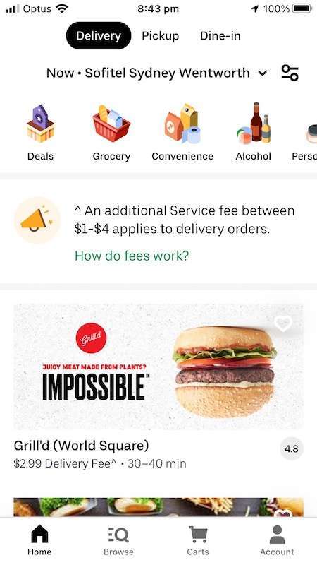
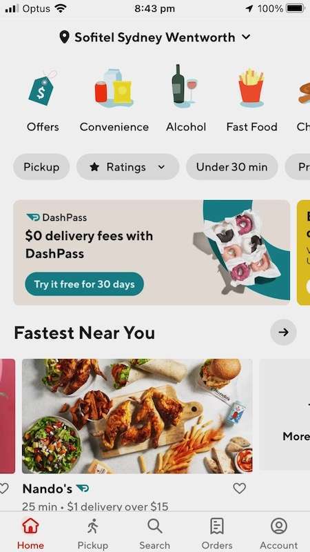
One interesting feature is the near identical layout and format of the home page for both. You could not tell them apart. The exception was the pick-up button at the bottom for Doordash while Uber Eats had it at the top along with delivery and dine-in. At first glance both had all the bells and whistles. Competition does that. It forces serious market players to up their game to remain competitive. So it was a level playing field.


Placing an order
This turned out to be the real test and unexpectedly. It is important to note that both apps executed well and you definitely get your food with no hassles.
The differences where and when it occurred were along the lines of being marginal, cosmetic and on speed. Even speed was micro marginal.
Doordash app did hang once and I had re-open it and on another occasion a page froze but the home button worked. But these could not be repeated or did not occur again. There was however one bug which I could repeat. If you backtracked from the cart and then went back, for a split second it would show empty cart and then actual screen appears with the ordered item in it.
Uber Eats was ahead when it came to placing an order. Why?
Intuitive
Firstly it is intuitive – you did not need to think twice to press a button. If you knew what you wanted to eat before opening the app, it allowed the flow. Here is a simple example. Your favourite restaurants or eateries are called “favourites” by Uber Eats but were called “Saved Stores” by Doordash. After placing a few orders I was looking for the word “favourite”. I am sure the word “favourite” is not patented.
Secondly the Google map indicating restaurant and the hotel and the distance was clear to the eye with route drawn. Uber Eats had grey and white version of the Google map. It removed all other shades and much of the information that you see in the usual Google map.
Doordash lifted the Google map straight with no modification so it appeared cluttered. They made it worse by placing promotion banner on the map just above the bottom, blocking parts of the map.
Thirdly Uber Eats photos of various dishes came out better in presentation and colour wise. Again slightly better. Uber Eats had all necessary info in one place and that helped. The formats though were near identical.
Categories and Restaurants
The various categories were nearly the same. The filters from ratings to delivery times were more or less the same for both apps.
Uber Eats had 390 + places listed for Asian cuisine while Doordash had 299+. The advantage was pretty much the same for other categories.
As you pick a food category and scroll down, the ones that are closed (not open) at that time and those that are no longer available are indicated near the end of the scroll. Doordash also had the same with one exception, they included their no longer available under closed. So if you thought you can try later in the day. It is still closed.
Uber Eats also had more restaurants shown in one page than Doordash, 4 compared to 2.5. It might be more on bigger screen phones. So by scrolling you covered more ground. My instincts tell me that most people would not scroll to the end.
The progress indicator from collection to delivery is more appealing than Doordash. It was on top and green while Doordash was black. The moving green throbbing indicator did give the sense things were moving along. Remember green is good from traffic lights to dashboards.
Good Recovery
I had one wrong delivery from Doordash. It had nothing to do with the app so no impact on the Uber Eats vs Doordash challenge. I suspected something amiss when the food courier (dasher by Doordash) messaged me for the Hotel name. And there was no restaurant delivery tag when the package was delivered. He must have delivered my package earlier to someone else.
Wrong deliveries do occur across brands. It however provided the opportunity to test recovery thru the app.
Quick tap of the help button, category of issue picked and a short description and I was put on the chat. Jema came over in a minute’s time. She arranged a reorder at my request. All done and dusted within 2 minutes flat. I was truly impressed. I got my food. And became a happy camper.
I did not have a similar opportunity to test Uber Eats but I did press their help button and stopped short of the chat. It was similar until then.
Conclusion
The Uber Eats vs Doordash challenge did show both were excellent. No issues with setting up the app, scrolling thru the various categories and choices and finally placing the orders. Both proved easy . They did the job well.
UI and UX were great with Uber Eats having an edge which is not surprising as they pioneered this years before Doordash was a thing. Their app size was also bigger.
I cannot think of any industry or sector such as banking, healthcare or even online retail with the exception of Amazon that offers this range of options and the high level of service. And all within an app. The humble phone has become a serious enabler.
