I walked into a store thinking it was the usual convenience store. It was not. It was different. This was in Dubai during a recent visit in early 2024. .
In my mind convenience stores like 7-11, EzyMart, Spar etc have a certain feel and look about them.
The ones in petrol stations in Australia like OTR and Ampol have a slightly different look but the product range is similar.
Convenience stores not just in Australia but in many countries typically serve essential household items. Plus a range of quick snacks and food such as milk, bread and take away noodles in a cup. And plenty of drinks.
Even in the UAE, such stores are commonplace. Most of us would know what to expect and what not to expect in such stores.
Weekly groceries are not done in such stores. It is usually a fleeting visit to pick an item or two quickly. You would not see someone take a bagful of items from a convenience store. It also serves customers late at night when most stores are closed.
Prices are typically higher at these stores but customers are seldom concerned. The items are generally small and the higher price reflects the convenience factor.
The Speedway Market in Dubai Marina
This store is in Dubai Marina, which has a large expat resident community and it is also a popular tourists location. The store is within a large luxury 25 storey residential condominium next to a 5 star hotel and facing the marina. It called itself a “market” as “Speedway Market”.
The other side stood a 5 star hotel and the large Dubai Marina Mall which has the British Waitrose supermarket.
The store has the door entry size of a convenience store. Unlike supermarket doors which tend to be double the size or bigger. Even minimarts have larger entry doors.
What surprised me was the large range of items stocked insid, covering more than essentials household items. Many of the items the usual convenience stores and minimarts did not carry.
The difference was noticeable. You knew the moment you stepped into the store.
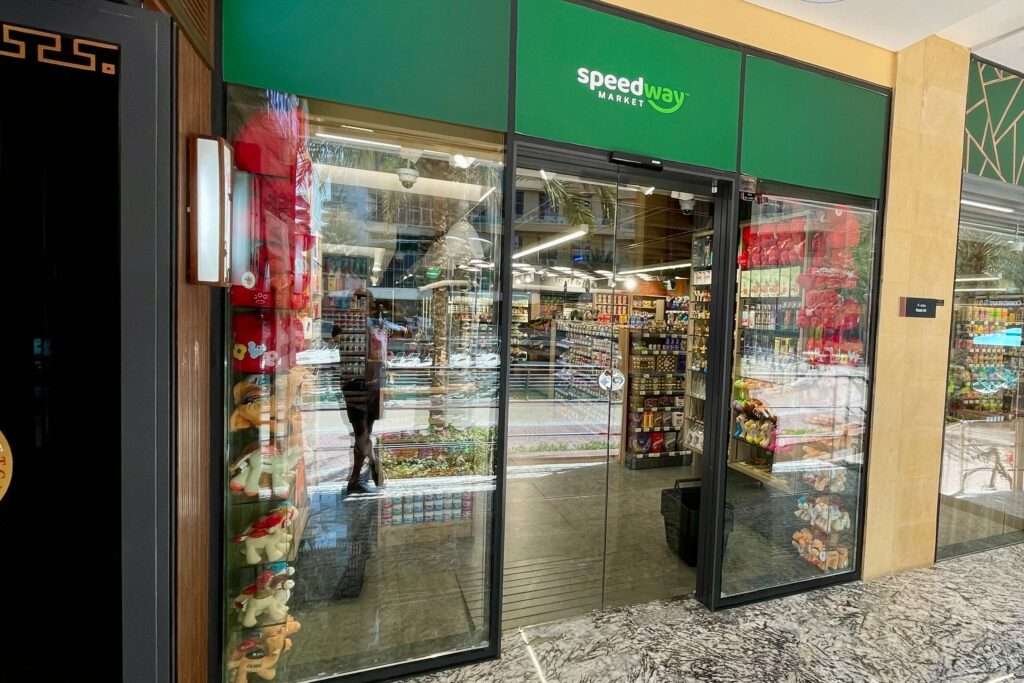
There has been a growing trend over the last 2 decades to have a downsized version of a supermarket. I first saw these type of stores in the UK, associated with major supermarket chains as Tesco and Sainsbury.
To serve limited catchment areas with essentials and daily provisions and these would be referred to as a minimart. In Australia, the large supermarkets have their versions of minimarts such as Coles Express.
Wall to wall
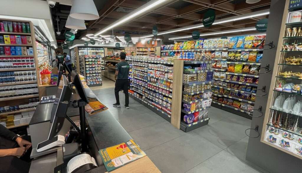
The first noticeable difference was that every wall was covered with shelves or refrigerators. The narrow side passage leading to the office was not spared. Even that passage had shelves on both sides with a further aisle to the left, one deep.
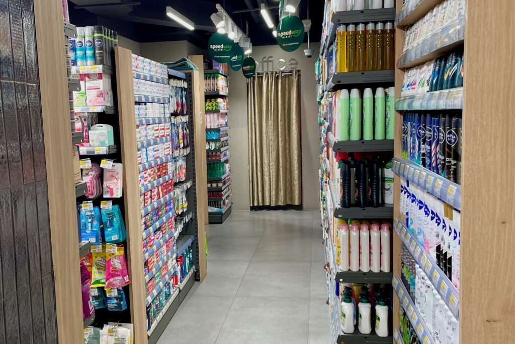
I am presuming pillars as well were covered with shelves. I realised that they had maximised space to an extent that I have not seen before. It explained why they could carry so much stock.
The aisles were not narrow or cramped nor did I think it posed a fire hazard. The fit-out was tastefully done. What it could not accommodate were standard sized shopping carts. Just shopping baskets.
Absolutely clean
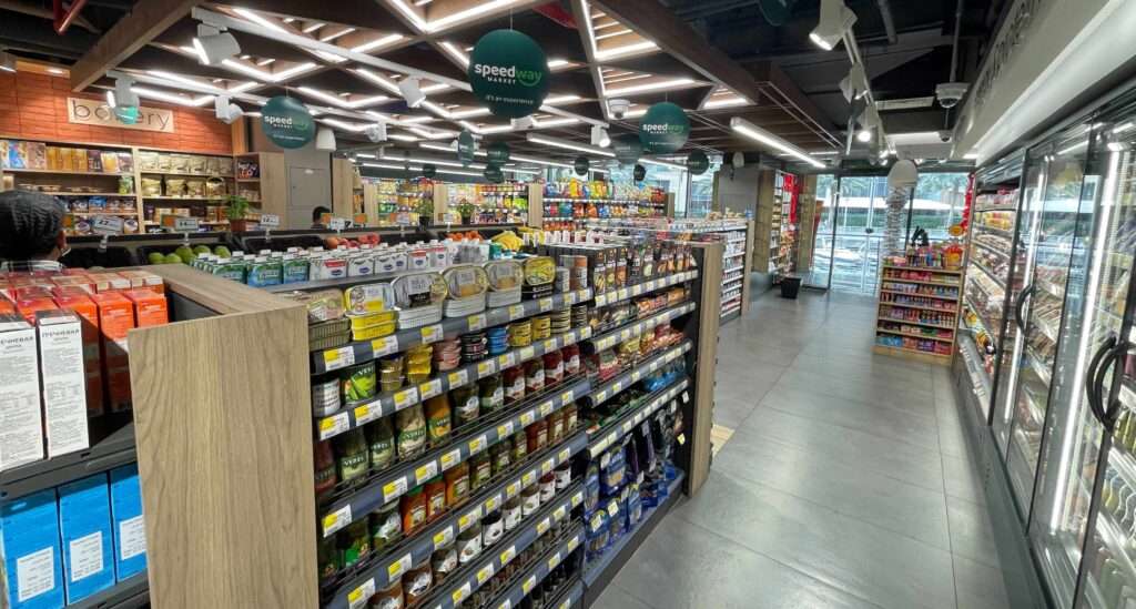
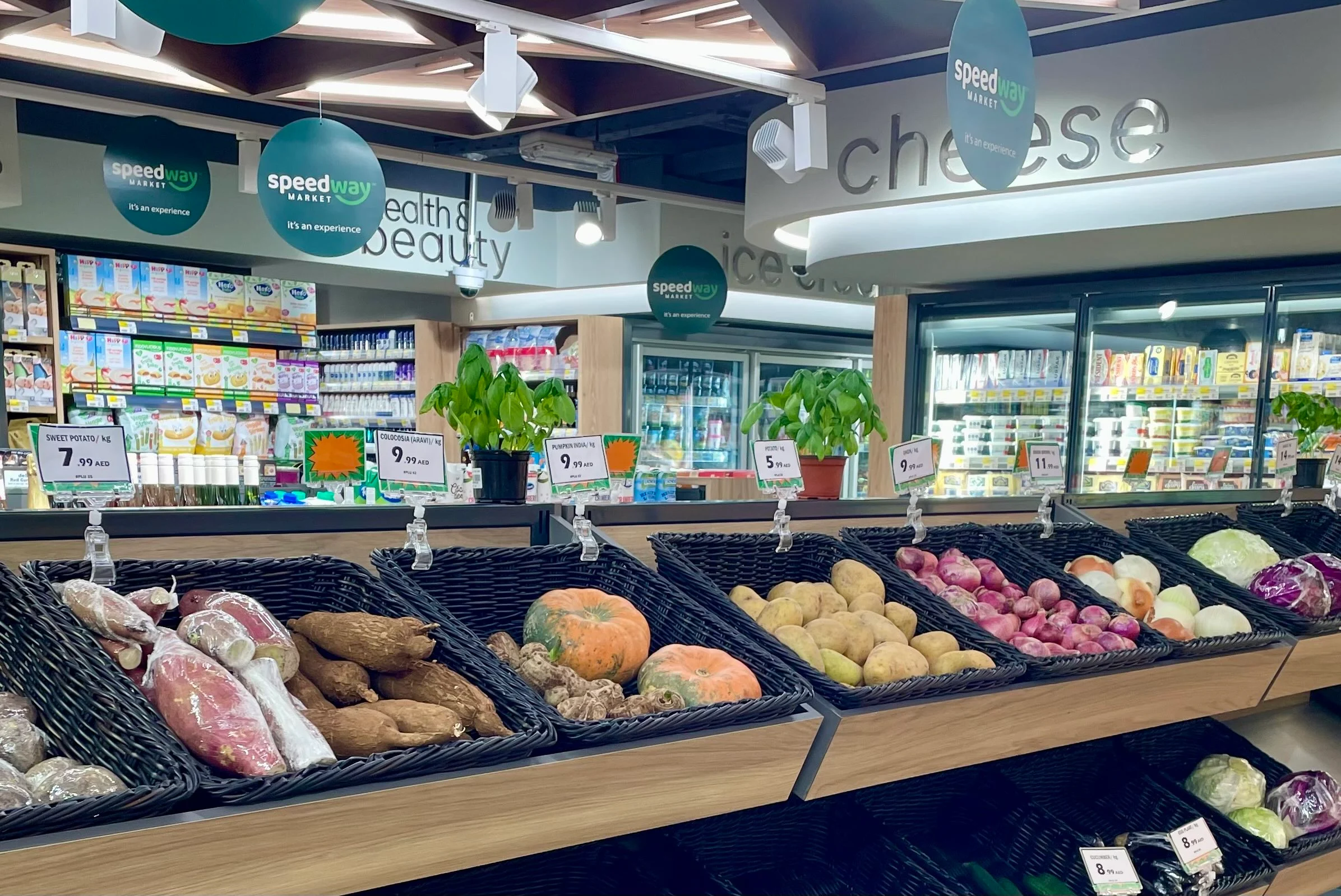
The second thing I noticed was how clean and tidy it was. In every aisle it was the same. Well stacked, properly arranged with products clearly visible.
The floor too was very clean. In terms of cleanliness and product organisation it was ahead of major branded supermarkets let alone any other retail store. OCD came to mind.
The same applied to the refrigerators. They too were well organised, well stocked and clean. I could not see a speck of dust anywhere and I was looking for some diligently just to be sure.
The aesthetics in regard to well designed signage and labels were of a high standard with very clear signage and fonts. The entire store layout was of high quality and showed professionalism despite the tight space.
During the duration of my stay and over a number of visits it remained clean and every shelf was stocked with no gaps.
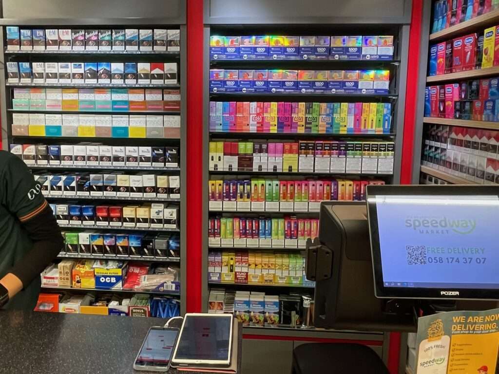
Product range
The product range as mentioned before was extensive for a place of that size. However fresh produce was limited. Including frozen meat and fish products. .
The range of drinks and beverages which generally carries higher margins were well covered. They even had Starbucks coffee cans. These sort of items I suppose are the bread and butter of convenience stores. I was surprised that their health and beauty section had all the well known shampoos, soaps and other grooming products. Clearly more than a convenience store.
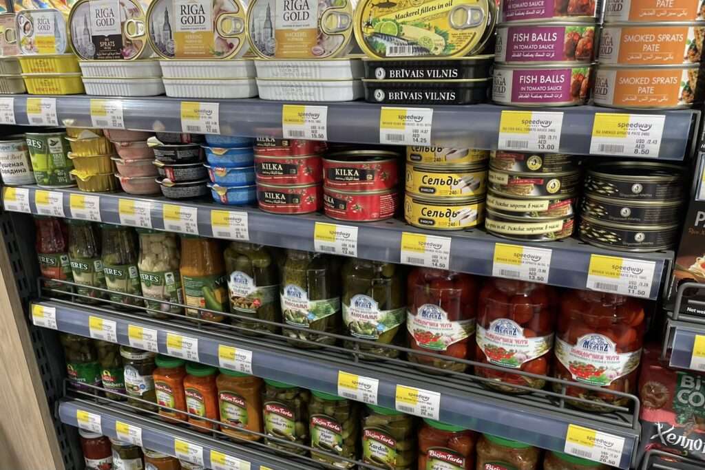
The range was also more international and than local and the brands generally known. They included some premium products..
Within product categories there were a variety of brands as well. I did notice a range of Russian products particularly jars and cans of pickled produce, clearly responding to the surge of Russian arrivals to Dubai.
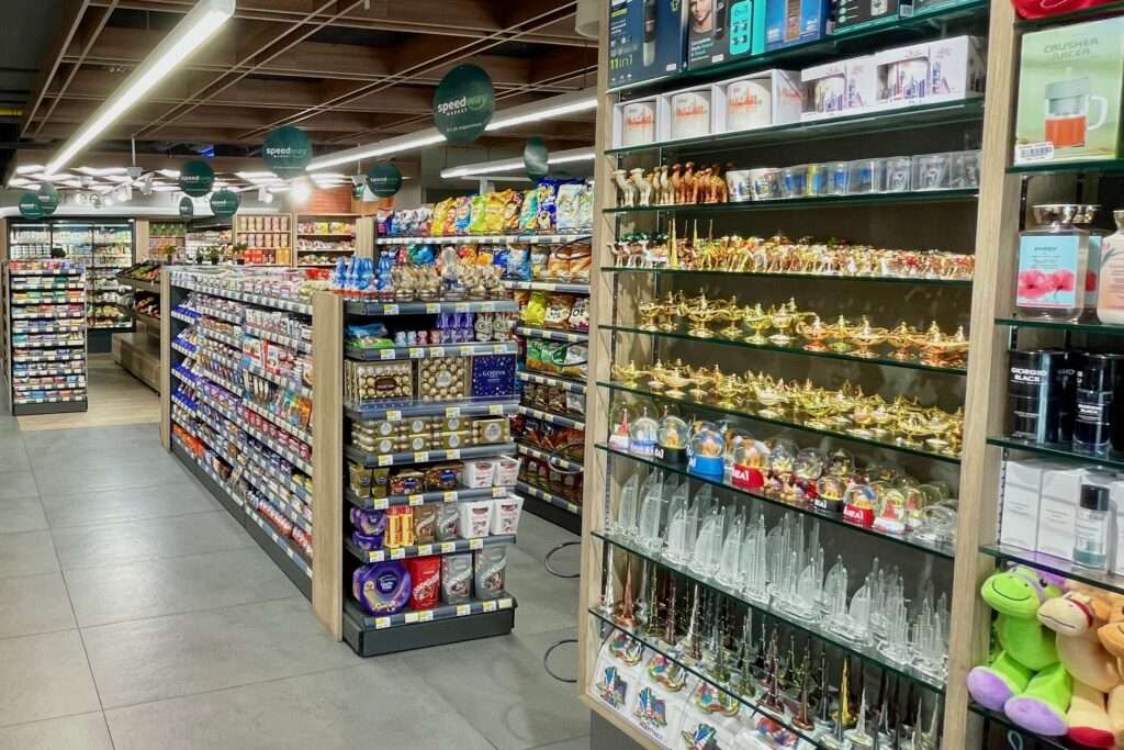
The clientele were not locals or workers but foreign expats and tourists from the West.
Functionality vs aesthetics
One of the key things you find in convenience stores and in supermarket is the store functionality as a retail outlet.
Aesthetics except for some branding is secondary. Sometimes fruit and food display are done well or when there is an event such as Christmas when the store is decorated but it stops there. After all customers are visiting to purchase groceries and essentials and nothing more.
This store was certainly functional on the high side as it was maximising space and providing such a wide range but also aesthetically pleasing in a functional way. If that makes sense.
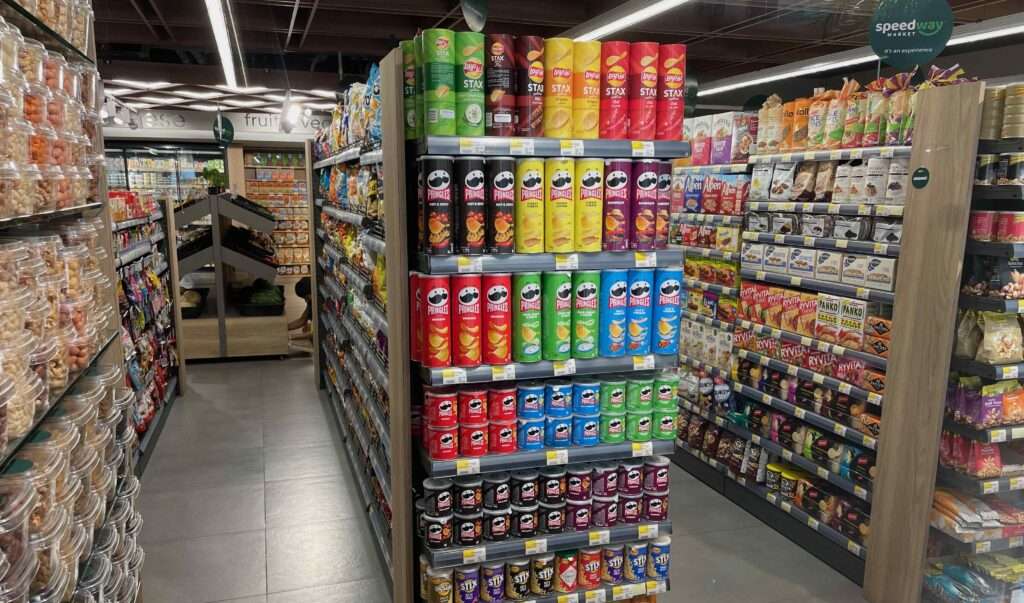
The font on signboards to identify product range was big, eye catching and new, not the outdated or conservative fonts.
The ceiling lightnings also had a decorative element to it unlike the usual supermarket and convenience stores. The shelves had light wooden veneer on the sides that gave a sense of warmth.
A trend maybe
I initially wondered if this store was linked to a big chain with a similar name in the US which is within the 7-11 family or linked to other major chain stores. The Speedway chain in the US however has a different branding and colours.
Talking to the staff, I was found that it is a UAE company that has 4 other stores. All 5 belonged to the same company.
It did however suggest that people managing it had invested more in the store design and had a background in retail. The use of a higher end professional shop fitters is clear. I also noticed that numerous cameras mounted on ceiling brackets covered every aisle.
The amount of capital involved told me that vision is long term and an attempt to build a model. So not your usual mom and pop store and neither a chain convenience store.
It did come across as a hybrid convenience store and minimart for the higher end clients who were residents nearby.
It was however not a premium boutique supermarket that handled speciality meats and produce that you find in upmarket precincts.
I wondered if this was going to be a trend. To appeal and hold on to their higher end customers within their small vicinity. Or else these customers would walk to the nearby supermarket.
